Rent-n-go
A faster way to get your rental equipment.
Rent-N-Go Ski Rental App
The Problem
Transporting traveler’s sports equipment to and from their destination takes time away from their vacation experience.
The Solution
Travelers can book their rental equipment in advance and is ready when they arrive at their destination for a stress free adventure.
My Role
UX Design
Tools Used
Figma, Miro, Canva, Google Suite, Zoom
Research Objective
Background
Travelers flying their outdoor equipment to their destination can incur more expense and stress. This can result in the users not fully enjoying their travel adventure, resulting in a less than happy experience.
Objective
To learn how travelers can book a trip with all outdoor activities and equipment rentals reserved in advance, giving the travelers a stress and hassle free experience while enjoying their adventures.
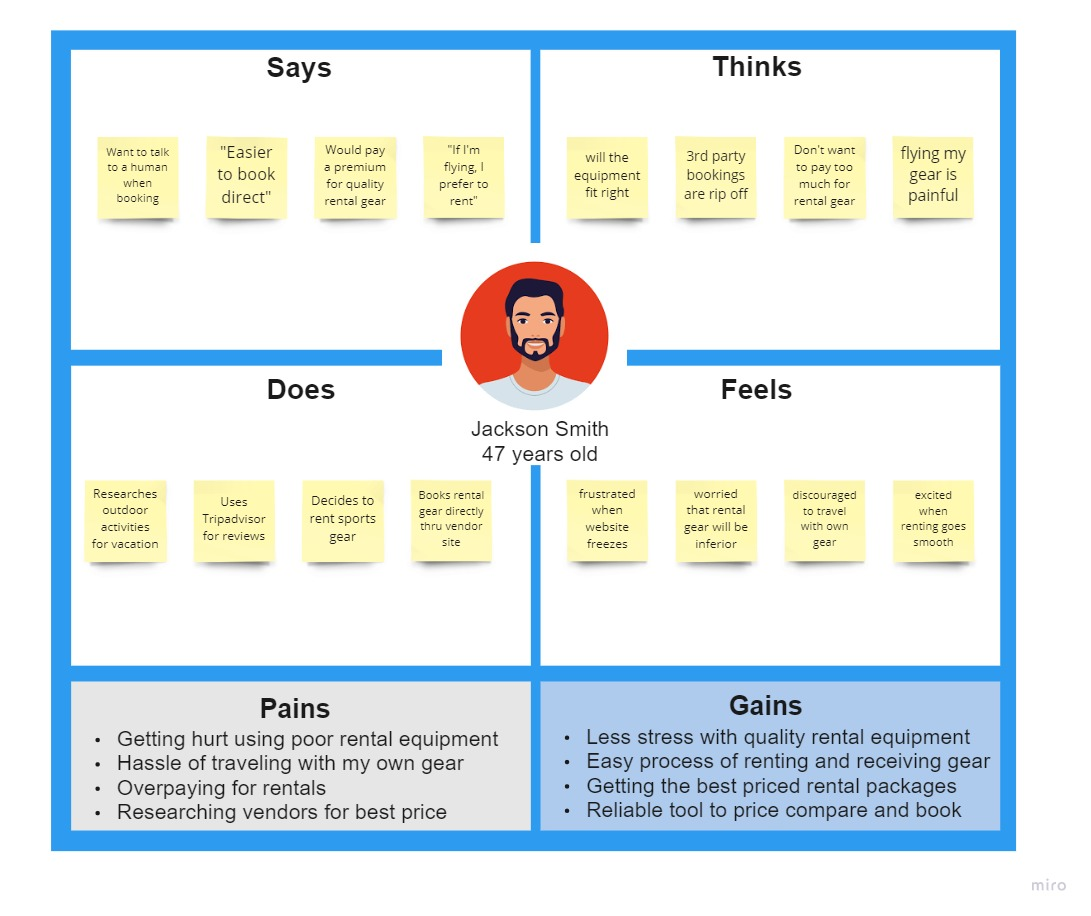
Empathy Map
Pain Points
Users who travel to destinations for outdoor adventures can have challenges deciding to travel with or without their equipment. Flying their sports equipment to their destination can be expensive and cumbersome. Searching for destination outfitters can be time consuming. Eliminating the pain point of travelers lugging their equipment when traveling with an app will allow the user to rent equipment and have it delivered to their place of stay. This allows the user to have a hassle free experience and start their vacation the minute they arrive.
There’s nothing worse than wasting time getting my gear when I could already be on my first run.
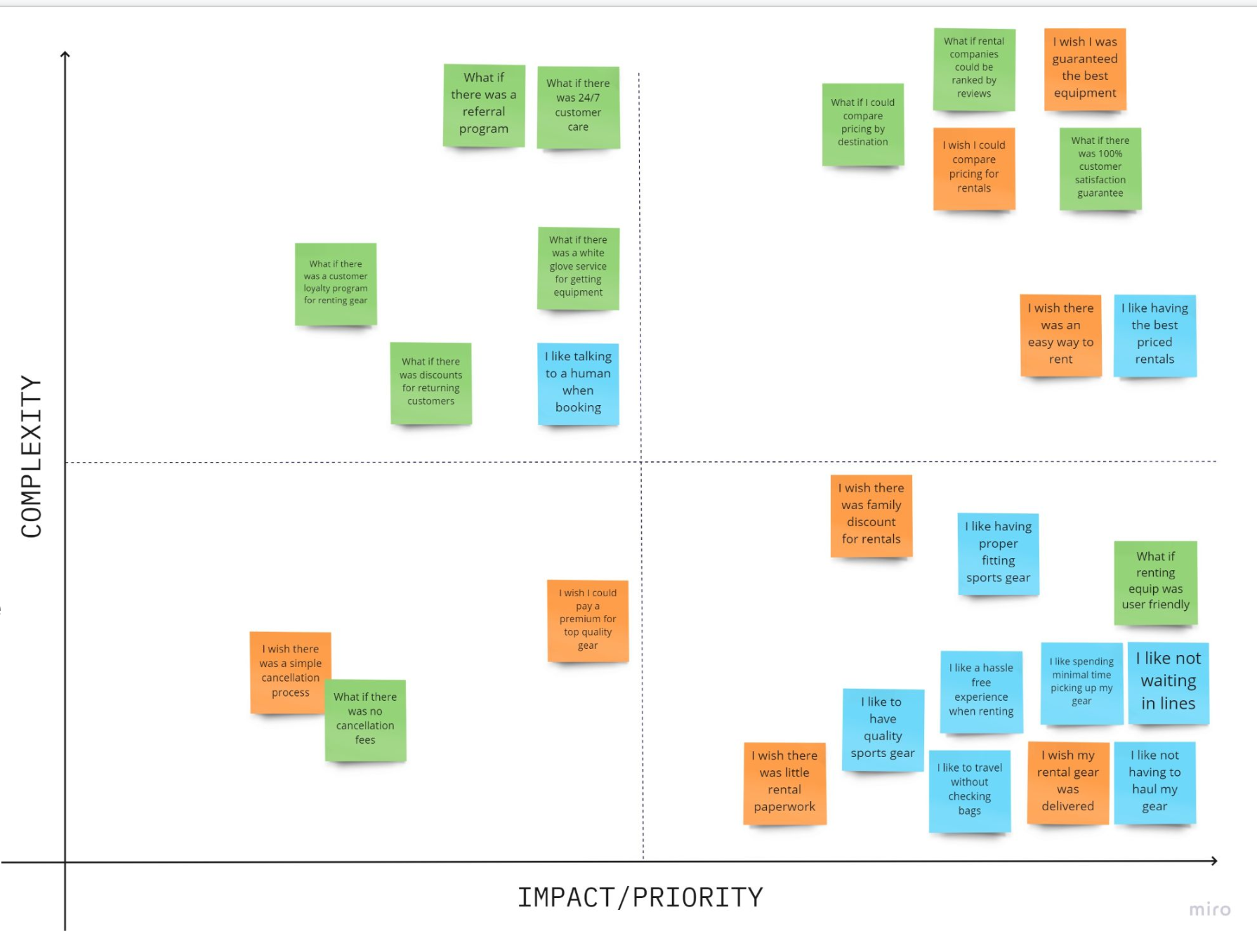
Prioritization Matrix
I interviewed 5 outdoor enthusiasts, and created an affinity diagram of the user insights. Analyzing the information, I grouped the user input information into categories. I organized the notes into a Feature Prioritization Matrix and determined the highest user value and priority for the Rent N Go app.
Best Now Idea
Delivering quality rental equipment to traveler’s place of stay
Best Future Idea
Compare rental pricing by destination
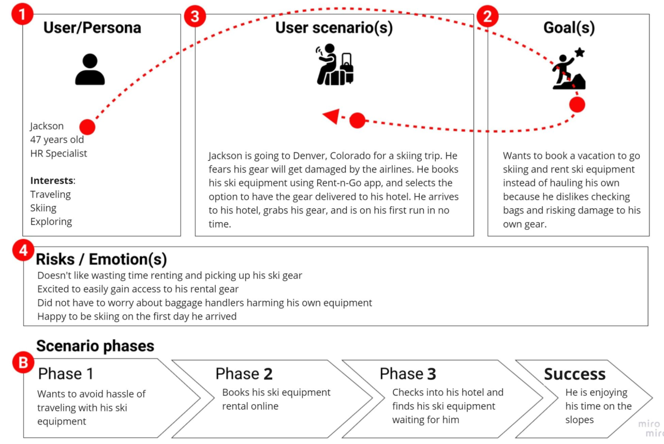
User Scenario
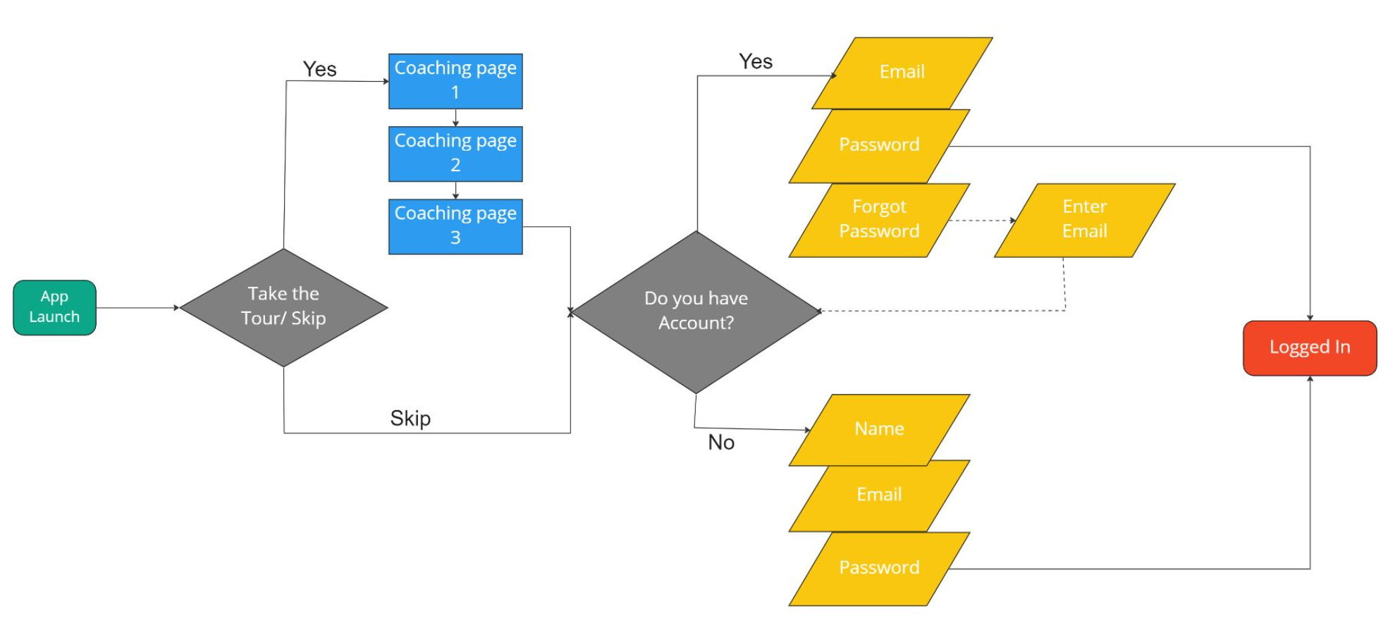
User Flow - Flow Chart for Onboarding
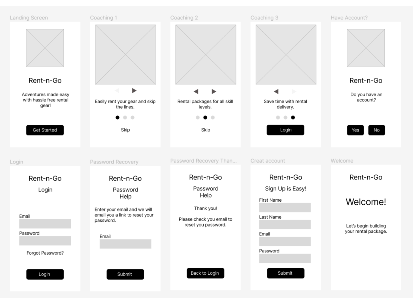
Wireframes
Iterations Based on User Testing
Usability test included 5 participates, and the test was performed via Zoom.
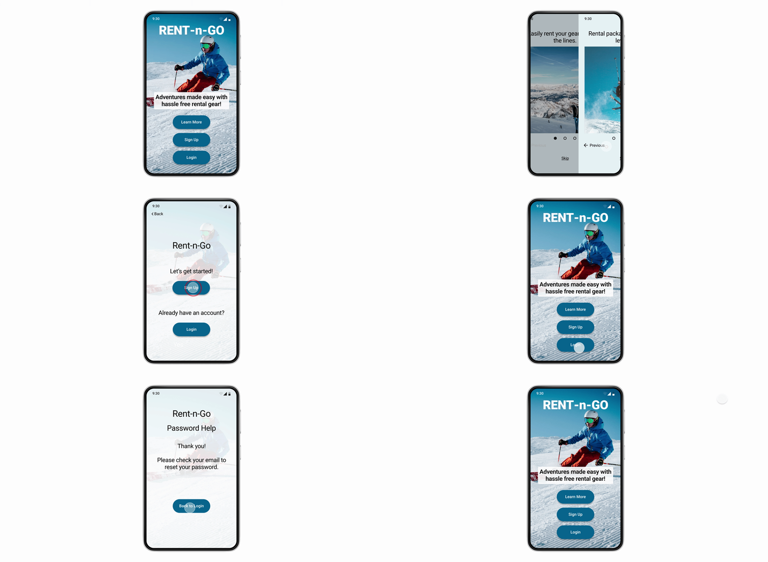
- Added “Sign Up” and “Login” to landing screen.
- Replaced “Get Started” button with “Learn More”
- Changed the “Have Account” screen with Signup or Login options.
- Renamed the “Skip to Login” to “Skip”
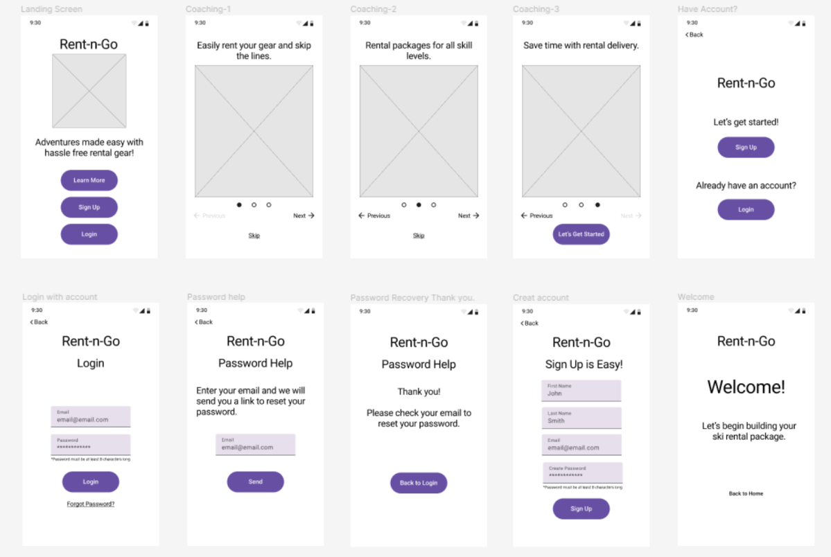
Final Prototype for Onboarding
Final Thoughts
In summary, I learned quickly during the user interview process that what I thought would be a popular solution was the opposite of what the users were looking for. I respect the need to always put the users first, because designing for the human experience can only happen if I am unbiased.
Another key takeaway was the importance of user testing. Viewing the prototypes through the user’s viewpoint was extremely helpful to iterate and fix problems that I didn’t know existed.
Overall, I realized that throughout the whole process from creating a Proto Persona to prototyping, the path is always changing and being modified so that the user’s needs will be met.
