Government Website Redesign
Creating a user friendly design that helps users quickly find online services for the MN DMV.
MN DMV Tab Renewal Redesign
The Problem
Government websites can be overwhelming with dense content and complex navigation.
The Solution
Redesign the website that is responsive, accessible, and gives all users a positive experience.
My Role
Research, Heuristic Evaluation, Testing, Card Sorting, Sitemap, Wireframing, Low- High Fidelity Prototyping
Tools Used
Figma, Miro, Canva, Google Suite, Zoom, Adobe Color Wheel
The Back story
Users visit Minnesota Driver and Vehicle Online Services to find information about driver and vehicle services, find locations, submit online forms, and schedule appointments.
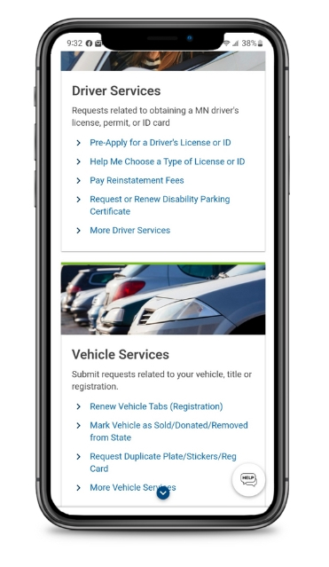
The current website has many broken links, non-existing navigation bar, and a problematic footer which can hinder users from using the online resources for their DMV needs.
“Why does the DPS Home link take me to a different site?”
The Main Focus
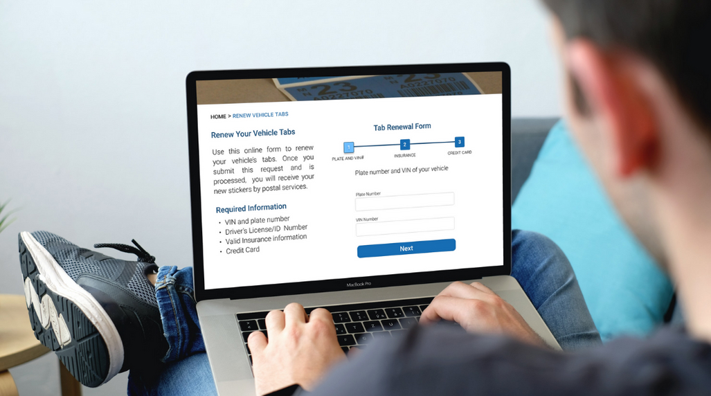
In this case study, the main focus was to fix broken links, improve the information architecture, and create an online form for users to renew their tabs. These improvements will enhance the online user experience, and allow the user to avoid long lines at their local Department of Motor Vehicle office.
Renewing vehicle tabs from the comfort of your home saves the user time and money.
Usability Testing
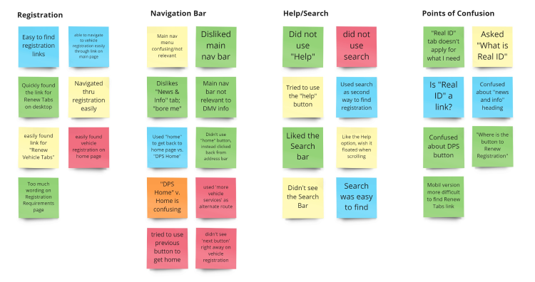
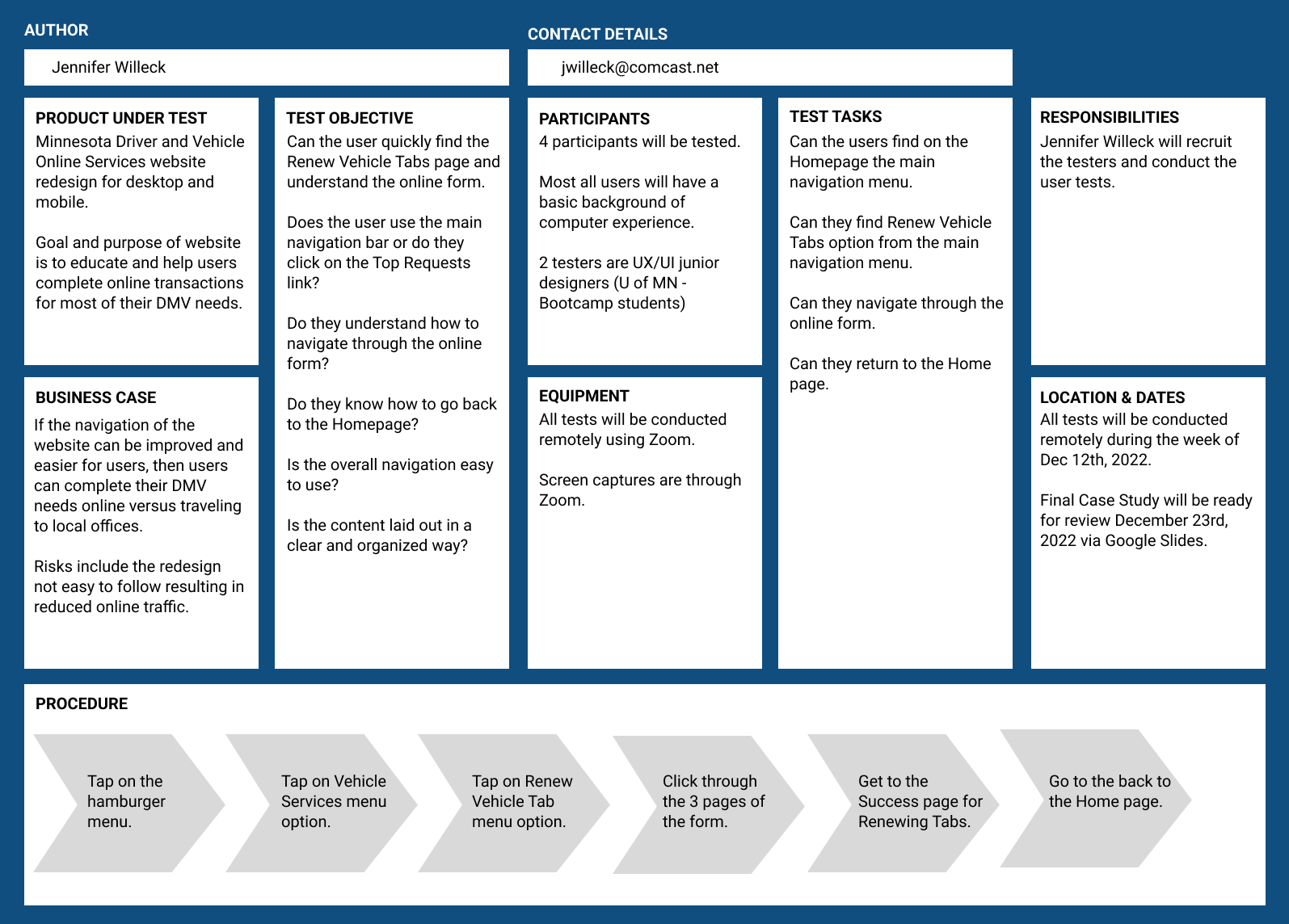
During user testing, users were tasked with renewing their vehicle tabs, and giving feedback on the navigation menu.
All the users were confused about the navigation bar and why there were links that were not relevant to the site.
It was determined the main objective in the redesign included a new navigation bar and a condensed vehicle tab renewal form.
Information Architecture
Card Sorting
Card sorting resulted in a restructured layout of categories and links.
Site Map
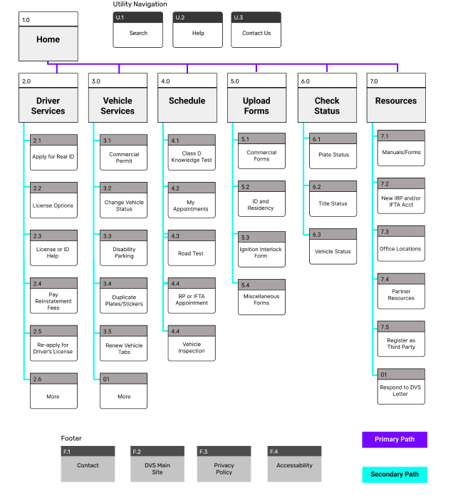
From the card sorting results, a navigation sitemap was created.
A significant change was grouping the two most important sections of the website, Driver and Vehicle Services, and organizing the dropdown menu items alphabetically for easier readability.
Mobile Wireframes
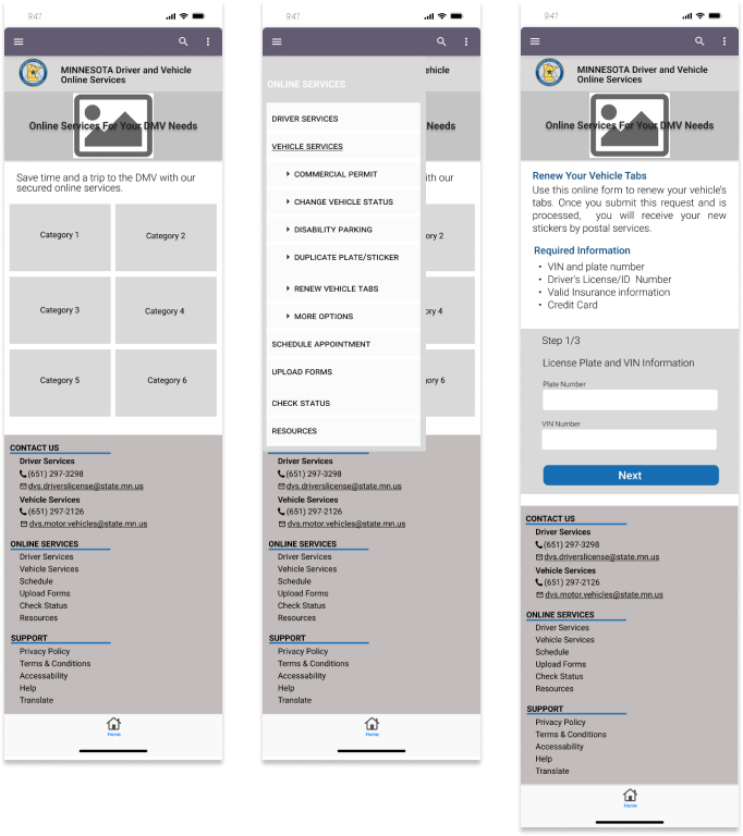
In the first round of prototyping, clickable wireframes were created and focused on easy navigation and user friendly online form.
The search bar is in the top header for easy access.
When the hamburger menu is selected, a slide in navigation bar with drop down menu is presented.
Large call to action cards are easily readable in the main content area.
The footer is condensed and organized.
Style Guide
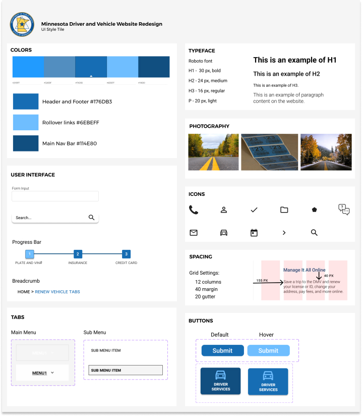
I created a style guide that was simple and not overwhelming to reflect a professional government website and is user friendly for all levels of computer experience.
The colors selected are analogous, pass the Adobe color test, and reflect the current Minnesota DMV logo and brand.
The typography includes the Roboto font for a natural and eye pleasing appearance.
The simple iconography was chosen for its clean design and to appeal for a broad range of users.
New Design Testing Plan
User Feedback and Iterations
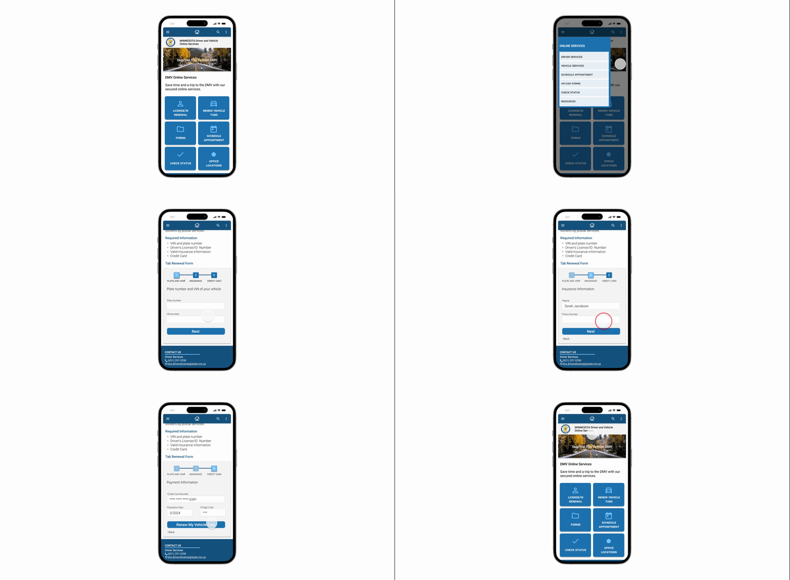
All users were able to easily find the Renew Vehicle Tabs page, click through the online form, and return to the homepage. Most users did not use the hamburger menu, but instead clicked the CTA link on the home page. Overall, positive feedback was received from the users.
Final iterations included:
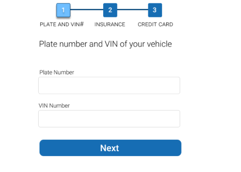
- added a progress bar on the form
- added animation to the form’s “Success” page
- animated slider to home page header
- added hover color to footer links
High fidelity prototype
Final Thoughts
After card sorting, it was interesting to learn how the government’s website navigation was reordered into new groupings. I found it challenging to structure the new sitemap in a way to ensure the navigation was user friendly and organized. Adding simple animation to certain elements was helpful to bring life to website and keep the user engaged.
