Nonprofit Website Redesign
Creating a better user experience to help fosters save animals.
Southwest Metro Animal Control - Case Study
The Problem
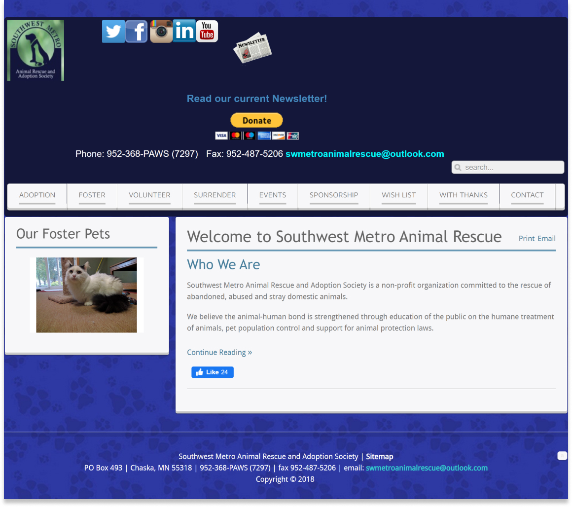
Current website looks or unfinished which may deter potential adoptions or foster providers.
The Solution
Redesign the website to be organized and user friendly to attract new volunteers, donors, and fosters.
My Role
User Research, Heuristic Evaluation, User Persona, Testing, Wireframing, Low-High Fidelity Prototyping
Tools Used
Figma, Miro, Canva, Google Suite, Zoom
The Back story
Southwest Metro Animal Rescue does not have a physical location or building. They are dependent on their online presence to reach their users.
Current website looks and feels unfinished which may deter potential adoptions or foster providers.
“Is this nonprofit still in business?”
“Where is the foster information?”
The Solution
Redesigning the Southwest Metro Animal Rescue website will create an accessible platform to find loving homes for animals within the community.
Main focus will be to design a user friendly process for users to foster or adapt animals.
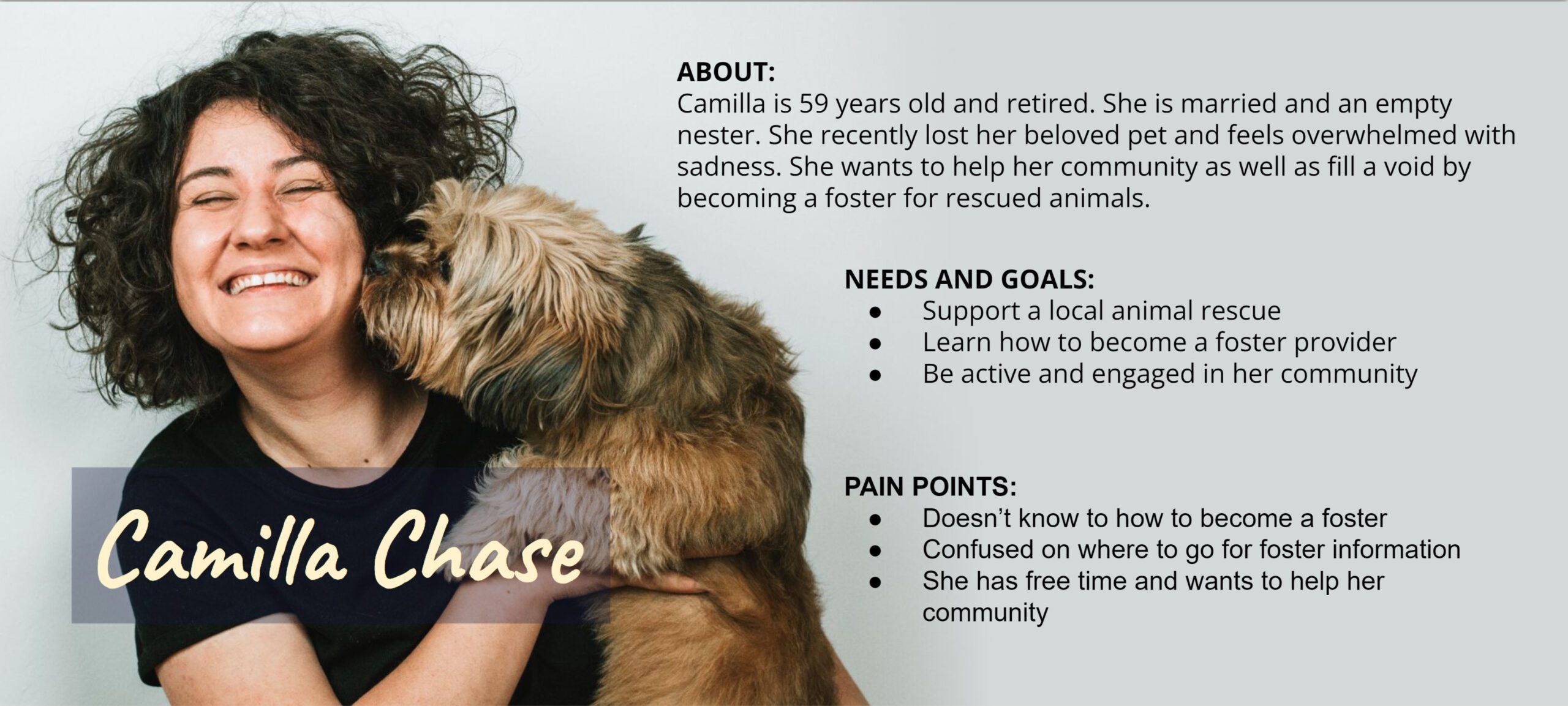
User Persona
Usability Testing
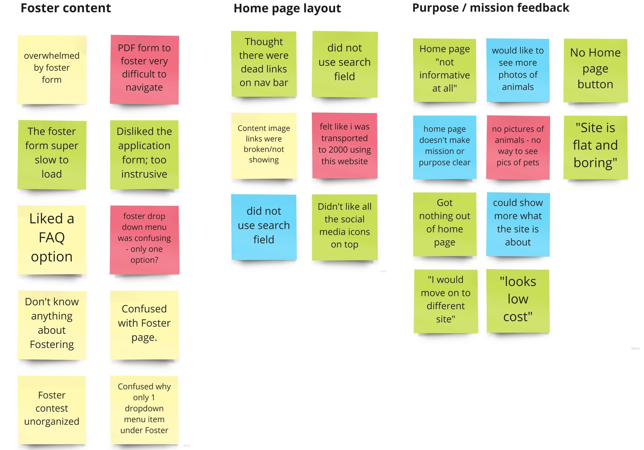
Interviewed 5 users and asked them to complete the task of finding animal foster information and fill out the online form.
All the users thought the website was difficult to navigate, and were disappointed in the 3 page foster application form. All the users stated they would not spend that much time on a form.
Top priorities from our findings included redesigning the home page to make the purpose clear to users, redesign the application form that is easy to use, and organize the content that is user friendly.
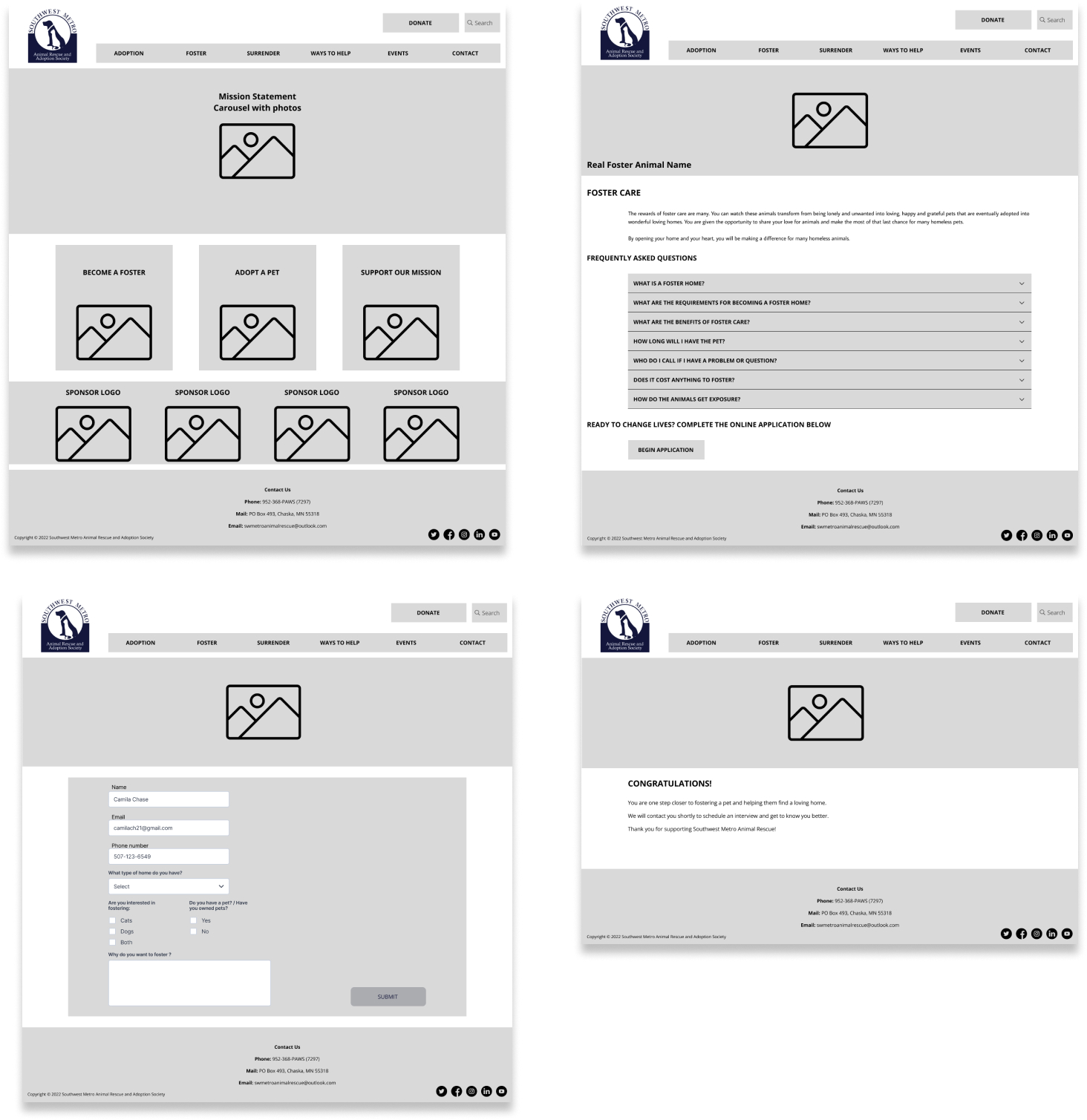
Desktop Wireframes
The homepage content is organized in order of importance. From left to right, you see the logo, then the search bar, to the Donate button.
The main nav bar is separated into its own section. The main content area has 3 call to action cards, and the footer is organized into 4 small sections.
The redesigned application form collects simple but important information to not overwhelm the user with a complicated form.
Usability Testing and Findings
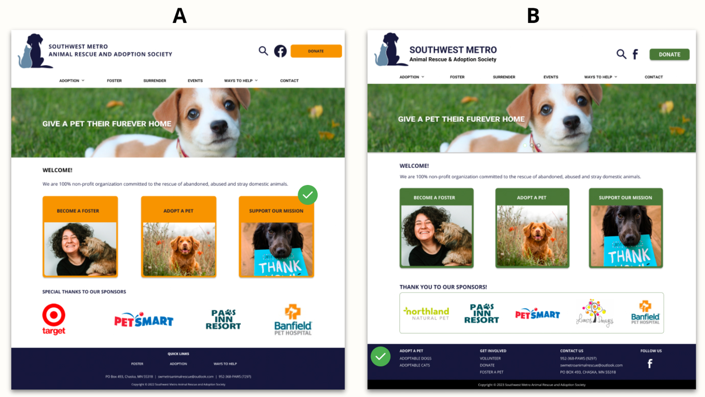
One area that a good amount of time spent on was the color palette. Unsure of the best colors for the design, A/B testing was performed for more clarity. As a result, testers liked the orange primary interaction color.
Users also liked the layout of the footer with helpful and organized links.
For usability testing, all users were able to find Foster information and complete the online form.
Style Guide
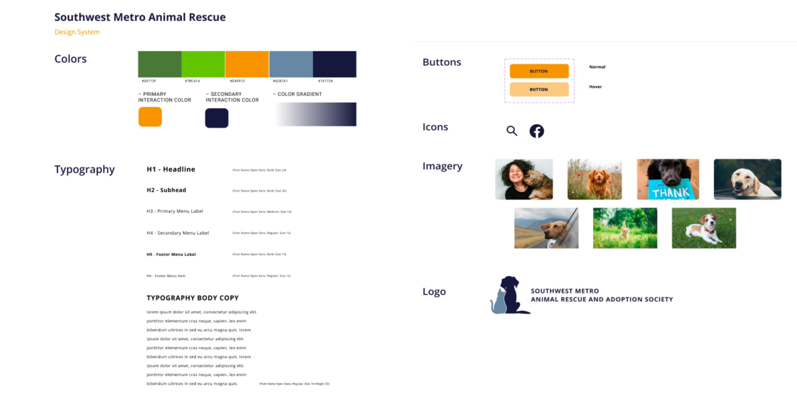
Open Sans font was chosen for its clean and modern typeface.
Animal pictures are incorporated to promote an emotional connection.
Overall, a simple and clean design was created resulting in the best user experience.
User Feedback and Iterations
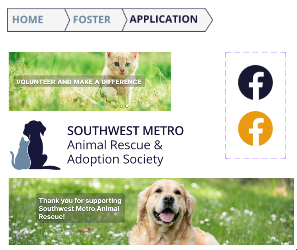
Some final design changes included redoing the logo due to its small font size. The logo was changed with a simple cat and dog image and increased the font.
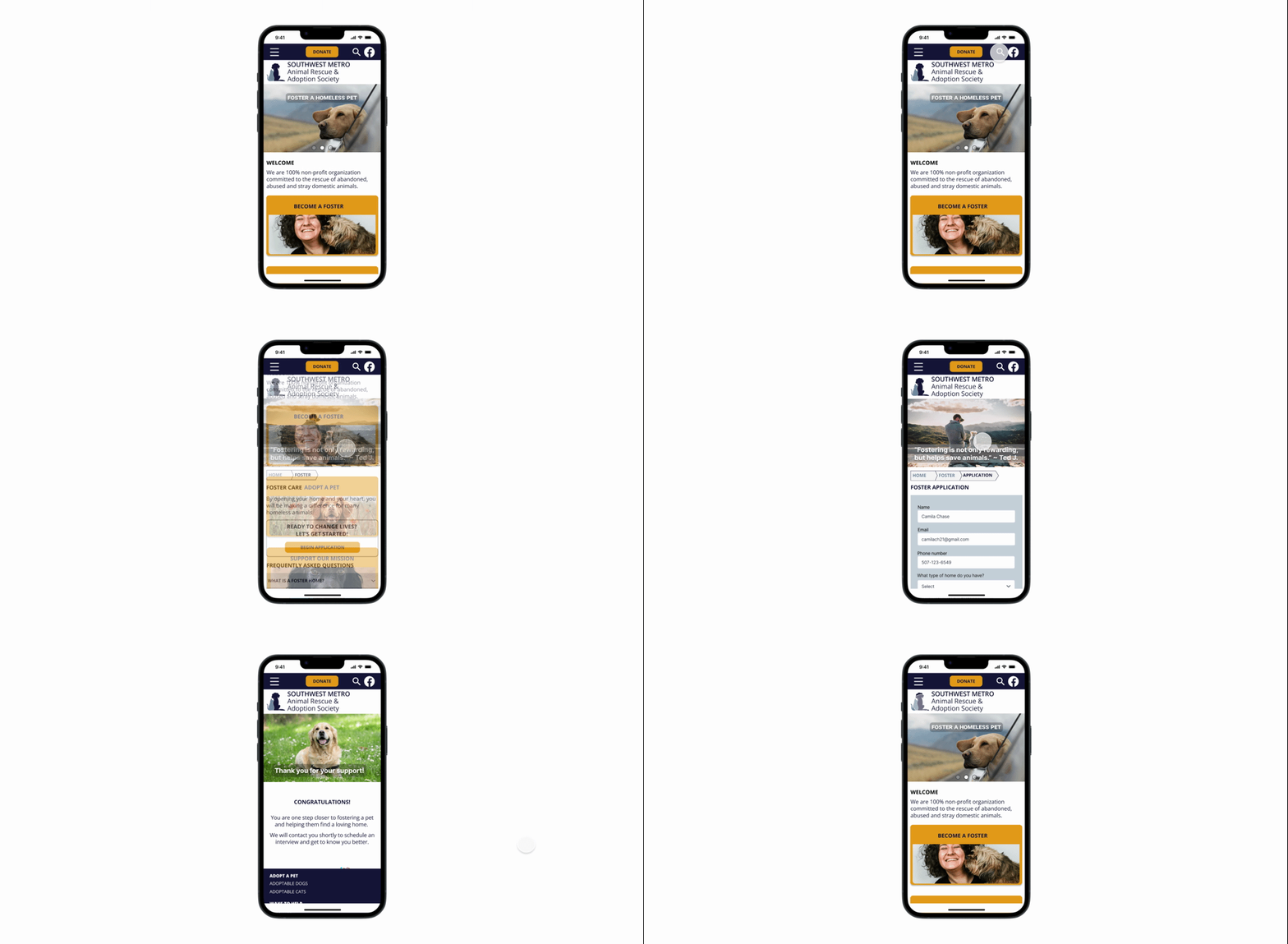
Other changes included adding breadcrumbs for easier user navigation, and a dark blue backdrop to enhance the main navigation bar.
Lastly, animated confetti was added to on the “Congratulations” page for fun interaction.
High fidelity prototype
Final Thoughts
It was unfortunate to not be able to connect with SWMAR. Their volunteers work full time jobs outside of volunteering, therefore they may not have the staff to respond to inquiries that don’t relate to adoption or foster care.
However, it is hopeful to connect with SWMAR and get their feedback on the redesigned website.
With the redesigned website, the goal is to help drive more traffic to their website and increase animal adoptions and foster providers.
