Diaspora - Case Study
The Problem
How can a user discover small artists and explore their works while also understanding the meaning behind the art?
The Solution
Create an online small artist gallery that will allow users to discover new artists from underrepresented communities and support their work.
My Role
UX/UI Design and Front-end Design
Tools Used
Figma, Miro, InVision, Google Drive, Slack, Zoom, VS Code, GitHub
User Research & Findings
Research
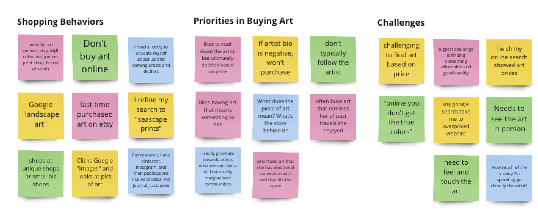
For our user research, our goal is to understand what tools and resources people are using to find and buy art and what their challenges are in doing so. We conducted a Google Survey to supplement our interviews and understand (1) how users discovered new artists and (2) if price and the artist behind the work were important in their decision to purchase art.
Findings
- Meaning behind art matters to the user; users like a connection to the art or artist
- Majority of users find art online
- Price is a challenge
User Persona
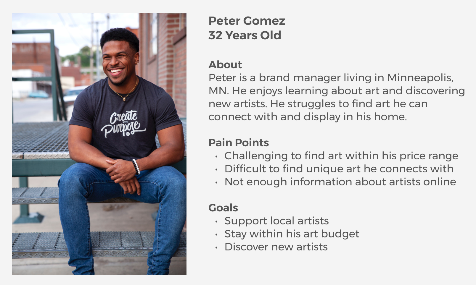
Meet Peter
Peter needs an online resource to discover small artists and understand the meaning behind the art.
“I wish I could support local artist but I can’t find their work online or now where to find them.”
Prioritization Matrix
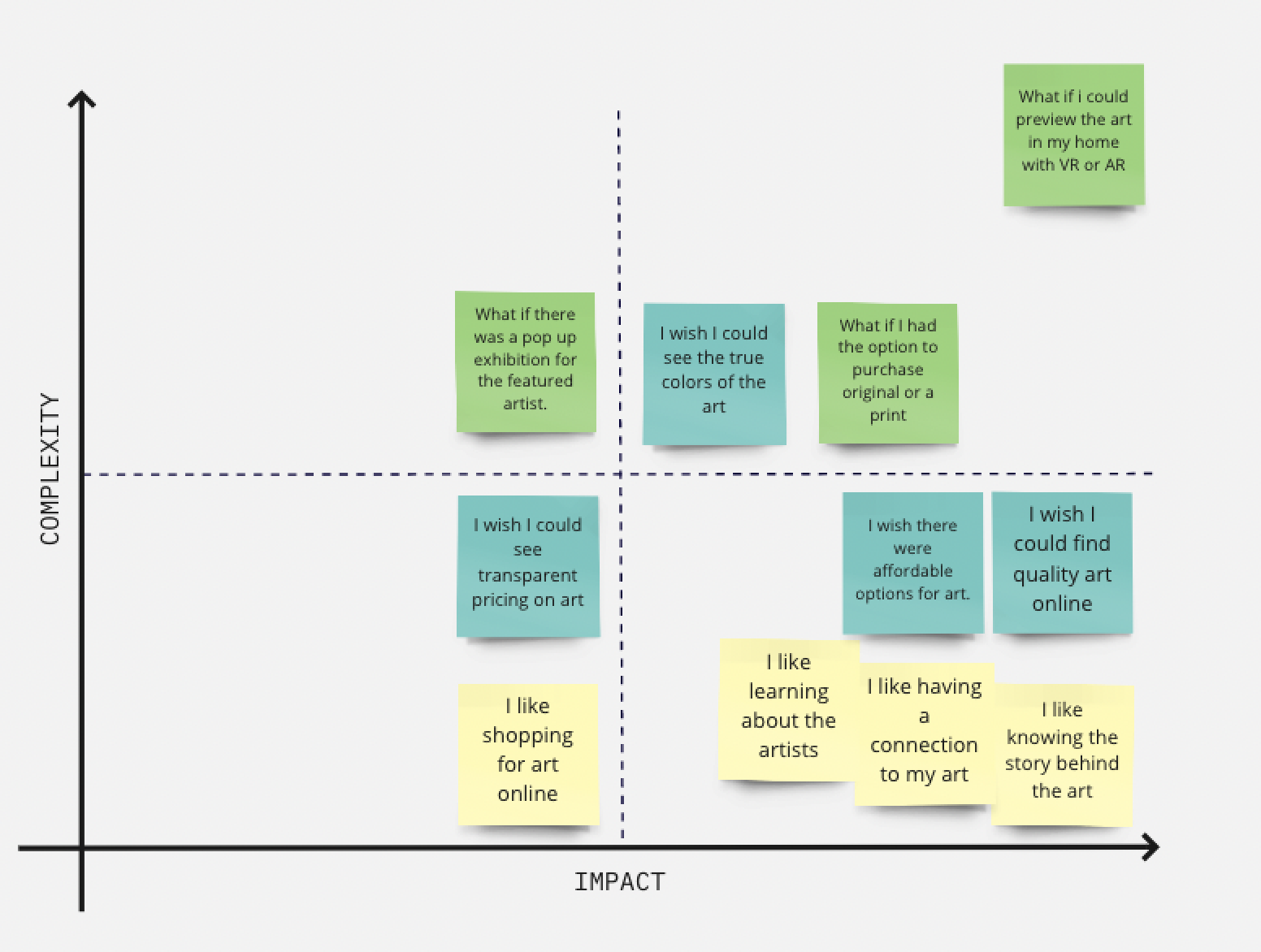
Featured Prioritization Matrix
Best Now Idea
- Featured artist with artist bio
- Descriptive information about the artists work
- Showcase small artists
Best Future Idea
- E-commerce so artist can sell work directly through website
- Art history information
- Click to add to your favorites list
Wireframes
Wireframes for Home Page
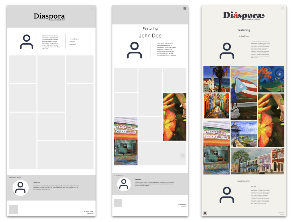
To keep the focus on the artist’s work, the intial design is purposely simple and clean.
The images will be displayed in a masonry grid, and when clicking on an image, the user will see more information about the artwork.
Only one artist will be featured at a time. The user can also view who the next upcoming artist will be with a short bio.
Usability Testing
Usability Testing and Findings
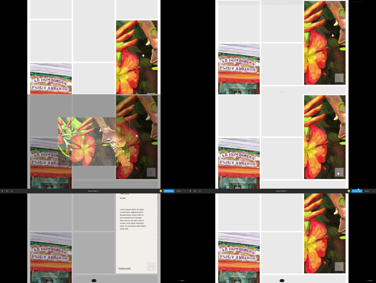
It was difficult for users to find information about the art.
Users were confused about the difference of clicking the art image vs. the plus box.
Users were confused about the purpose of the site.
Iterations
Prototype Iterations Based on User Testing
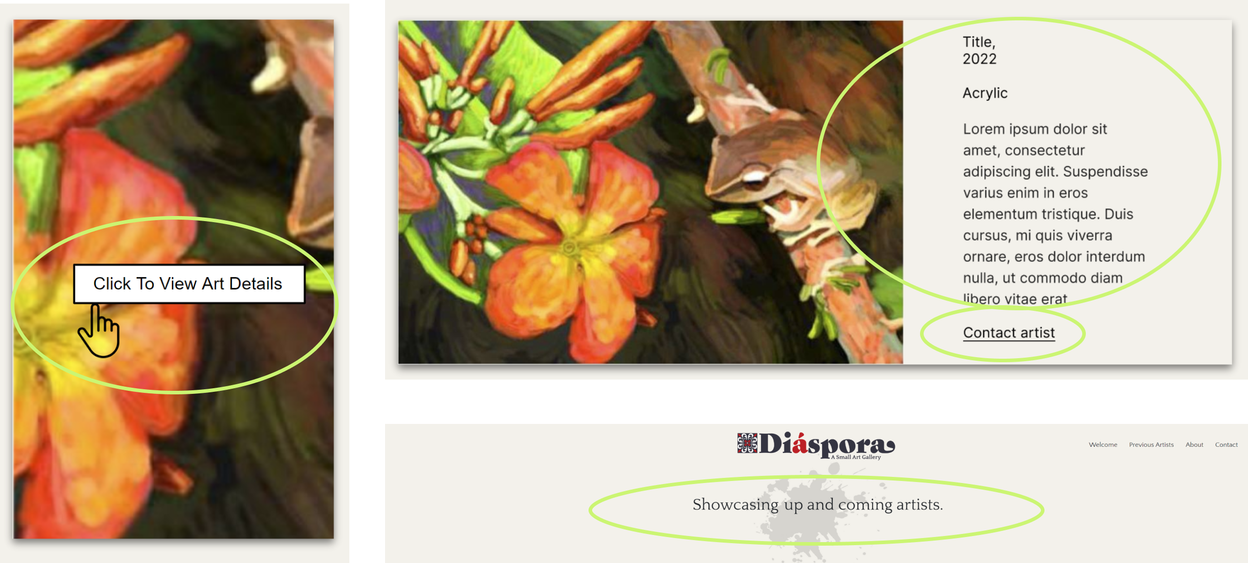
- Added hover title “Click to View Art Details” to image.
- Added artwork description to the expanded image.
- Added “Contact Artist”
- Added a mission statement to top of home page
Final Design
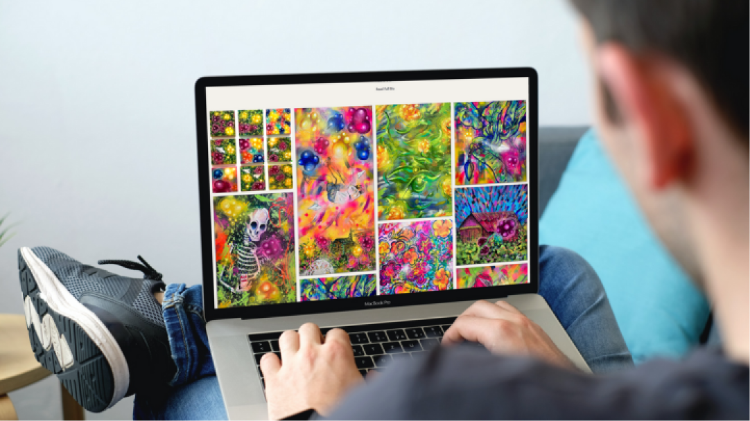
Final Website Design
- Coded in Visual Studio
- HTML, CSS, Bootstrap and JavaScript
- Published on GitHub
- Responsive design for all devices
Final Comments
In conclusion, the area I enjoyed the most in the design process was coding the final design, and using my background designing experience to build the site.
The users gave positive feedback of the final design and especially liked the capability to easily email the artist with a simple online form.
The stakeholder in this case study is an artest from Puerto Rico. He gave positive feedback and appreciated the design of the website showcasing his work.
